
Best Practices for Data Visualization
A Collaborative Workshop with Schmidt Sciences
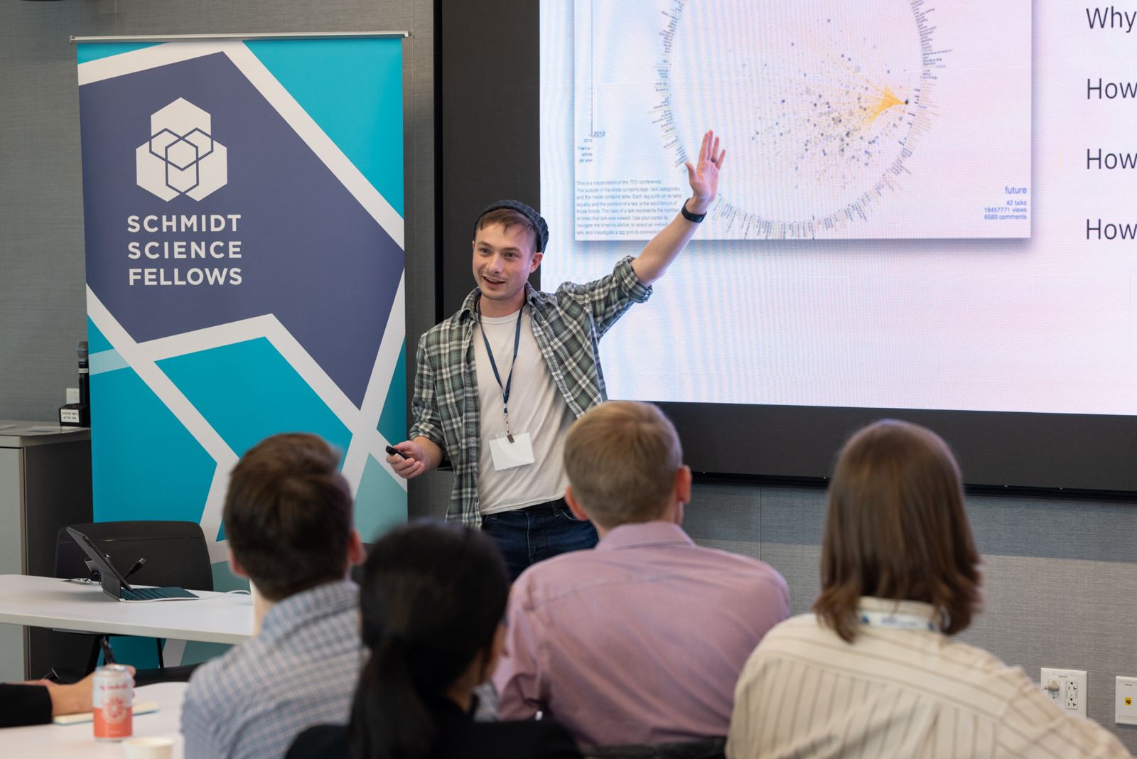
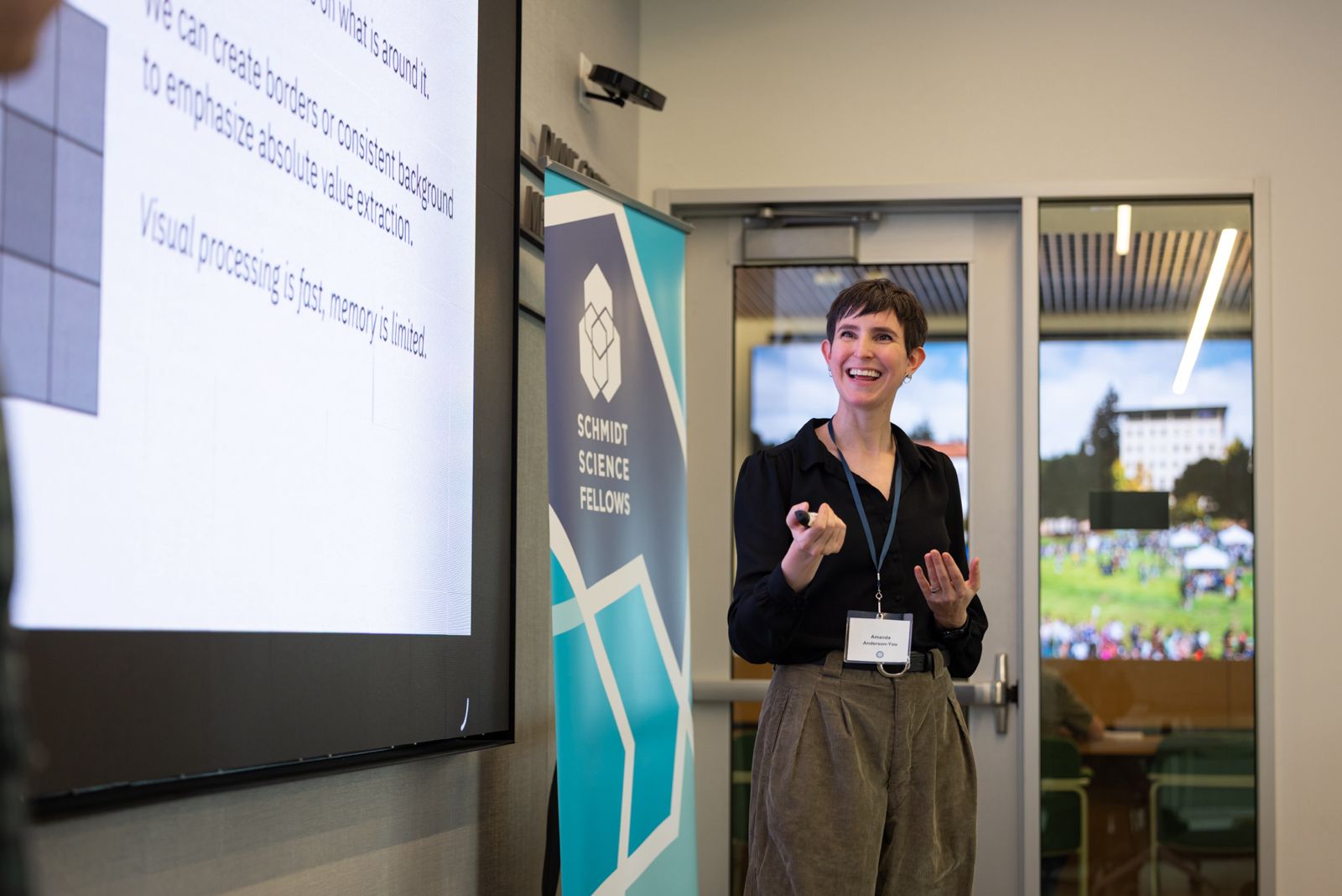
Sam Pottinger (Senior Data Scientist) and Amanda Anderson-You (Data Visualization Developer) recently led a collaborative data visualization workshop for over 30 Schmidt Science Fellows on campus.
We were honored to share our team’s expertise with this highly engaged and passionate group of scientists! Thank you to all Schmidt Science Fellows who joined us, and to the entire Schmidt Science Fellows team for this wonderful opportunity.
Creating Beautiful and Clear Data Viz
Many researchers appreciate the immense power of data visualization to effectively communicate research findings to academic and non-academic audiences. However, how to develop and hone data viz skills is not often part of a science curriculum for undergraduate and graduate students. Sam and Amanda walked Schmidt Science Fellows through justifications for using visualizations in their research, and shared best practices for designing and thinking about data viz.
Use of Color

💡TIP: Color is contextual. Consider reserving color for aesthetics or branding and utilizing other encoding devices like direct labeling in lieu of color when appropriate. All visual cues hold meaning. Above, a US district map is color-coded using an ombre effect, where one shade of green varies from light to dark to show comparative data.
Use of Animations

💡TIP: Although standard line charts can convey precise quantitative information, animated visuals can be more powerful in terms of delivering a more emotional or impactful message. For example, above is a still image from this website developed by DSE, which helps policymakers at the United Nations visualize policy impacts to reduce global plastic consumption.
As contrast, below is a web-based animation that showcases relatively the same information (global plastic consumption) but in a more visually striking way. Both were developed with our colleagues at the Benioff Ocean Science Lab at UC Santa Barbara as part of our collaborative work with the United Nations’ global plastics treaty.

For more examples of DSE data viz, scroll through some of our favorite visuals we recently created to support Tribal partners, global policymakers, and federal agencies here.
Helpful Design Tools
Sam and Amanda shared tools the Fellows might find helpful in developing data viz, including how to use Claude or other AI assistants to produce sophisticated but time-intensive graphics.

Background on Schmidt Science Fellows
Schmidt Science Fellows are the next generation of science leaders in astronomy, biology, chemistry, physics, earth sciences, engineering, mathematics, or computing. In the final months of their PhD programs, the fellowship program supports students in their development of interdisciplinary science and leadership skills, and provides unique collaborative and mentorship opportunities. Learn more.